Dark mode for whiteboards is harder than it looks
On September 10, Bending Spoons agreed to buy Miro for about a tenth of what it was worth in 2022.
That’s a lot of people wondering what happens to a tool they use every day. So I went and read what they’d been asking for.
The top request on Miro’s idea board is dark mode. It was posted in May 2020. It’s now old enough to start first grade. It has 2,418 votes, 338 replies, and 90,167 views.
The very first post was polite. It thanked Miro and said dark mode would understandably be “no small task.”
It was right.
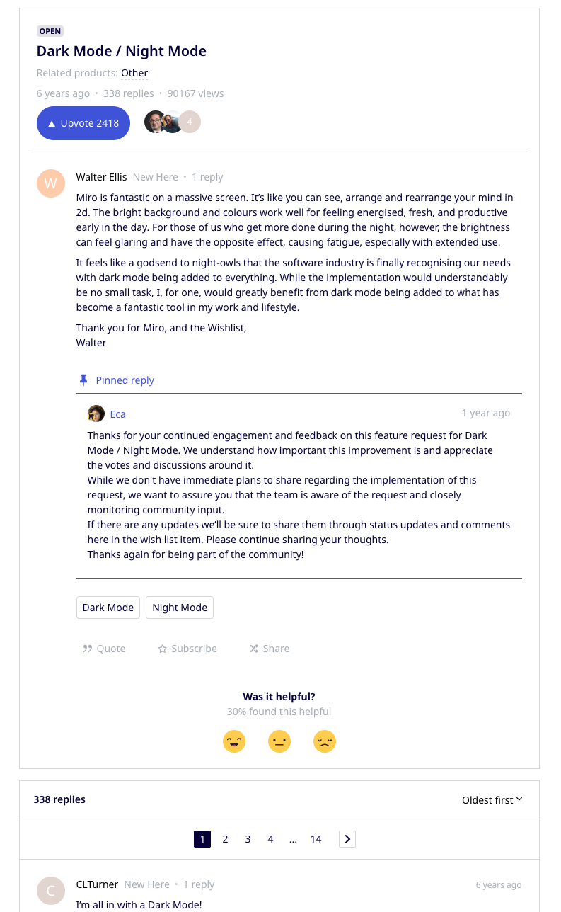
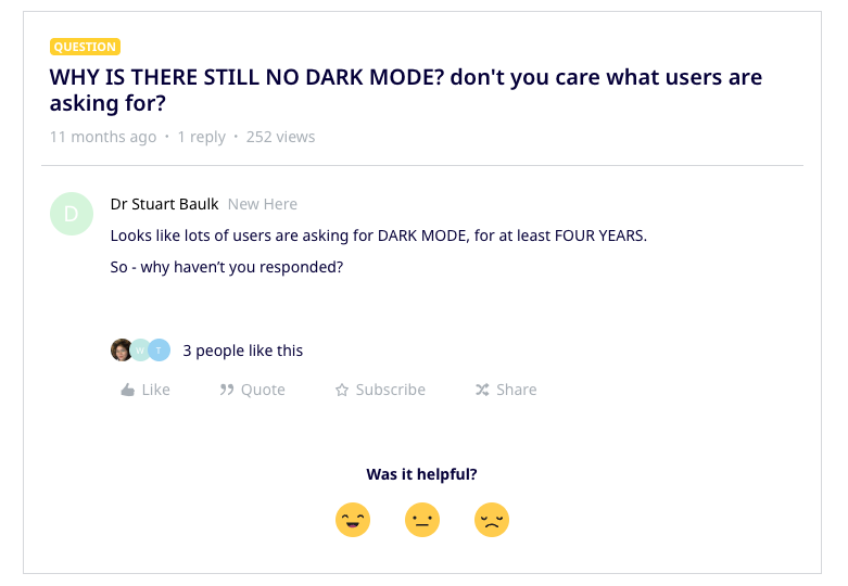
People keep asking anyway. New threads get opened and gently walked back to the original. Last fall, one arrived in all caps.
FigJam users have asked for the same thing since 2021.
CardBoard shipped dark mode this week. Here’s how we did it, and why it’s harder than it looks.
Most dark mode isn’t hard
Last fall a FigJam user called it “this simple feature.”
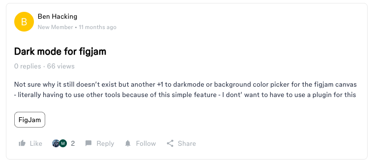
So which is it? No small task, or a simple feature?
Both. In most apps, every color has a job. Background. Text. Border. Button. Dark mode means writing a second set of colors for the same jobs. Flip a switch, swap the set, ship it.
That’s real work. But if that were all dark mode was on a whiteboard, it would have shipped years ago.
A whiteboard isn’t most apps
On a whiteboard, some of the colors aren’t yours. They belong to the person using it.
When someone makes a card yellow, yellow means something. Maybe it’s a risk. Maybe it’s a question for the client. If dark mode turns that yellow into mustard, you just changed what they meant.
So a whiteboard has three kinds of color, not one.
There’s the app: toolbars, menus, drawers. Those are ours, and they can go dark.
There’s the board: the cards and the background they sit on. Those belong to the user. They don’t change when the theme changes.
And there’s the stuff in between: selection rings, divider lines, the dashed outline around a suggested card. The app draws these, but it draws them on top of the user’s colors. They have to stay readable on any background the user picks.
That third group is where it gets hard. It’s also where the workarounds fall apart.
The most popular workaround, on Miro and FigJam alike, is to draw a black rectangle the size of the board, send it to the back, and lock it. This is, technically, dark mode. It is also, technically, a rectangle.
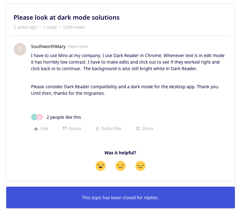
The next step up is a browser extension like Dark Reader. An extension can’t tell the three kinds of color apart, so it darkens everything. One Miro user, whose company requires Miro, runs it every day. When they edit text, it goes so faint they have to click away to see what they typed, then click back in to keep going. The board itself stays bright white.
I can’t tell you why Miro and FigJam haven’t shipped it. I can show you what was hard for us.
The map
We plan our work in CardBoard, so dark mode got a story map.
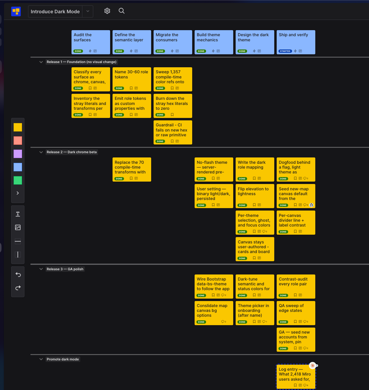
The top row is the path: audit every screen, name the colors, move the code over, build the switch, design the dark theme, ship. Under it, the work is cut into three releases.
First, change everything underneath and nothing on screen. Then turn dark mode on for our own team only. Then hunt down the edge cases and give it to everyone.
Start to finish, it took about three days. I directed the work through Claude.
We had one unfair advantage. Nobody had to approve it but me.
Four boards
The first thing dark mode broke was our board backgrounds.
CardBoard used to offer a row of pastel backgrounds. Most boards never used them, and none of them had a dark version. Put a pastel board inside dark menus and it glowed.
So we cut them. Now there are four: Light, the whiteboard; Medium, a quiet gray; Dark, the blackboard; and Chalkboard.
The background is your choice, not the theme’s. Pick Dark, and everyone you share the board with sees Dark, whatever theme they use.
Then Dark looked wrong. The first version was a shade lighter than the toolbar sitting on it, so the toolbar looked like it was slowly sinking into a tar pit. On a real desk, the thing on top catches more light. So we pushed Dark down until it was the darkest layer, and let the toolbars and drawers sit above it.
The green took the longest. Most greens look like Minecraft. We wanted a chalkboard, not a creeper. The one we kept has barely any color in it. You notice it as warmth more than as green.
Last, the dividers. They were one flat gray, and a gray line on the Medium board nearly disappeared. Now each line takes its color from the board it’s drawn on.
Making the switch boring
Every color in CardBoard used to be named for how it looked. Gray 100. Cobalt 600.
You can’t make “gray 100” dark. The name would lie.
So we renamed the colors by their job instead: surface, primary text, subtle border. Then we moved 1,357 color references in the code onto the new names.
Once every color had a job, the dark theme was just a second answer to the same questions. It came out to about 60 lines.
This part went fast because the hard half was already done. Last month we went looking for our card palette, so an agent could name a color and mean it. We found it living in five places at once. Cutting that to one is its own story. By the time dark mode came around, the habit was set and most of the plumbing was in.
Hunting corners
Dark mode breaks in the corners, so we went looking for corners.
The drawer that connects a board to Jira or Azure DevOps. The suggested cards Claude proposes on your board. The little marks that show a collapsed section. The Azure DevOps sign-in page, where our own heading went invisible.
We checked each one on all four boards. Every dark text color passes the WCAG AA contrast standard. And the page never flashes white when it loads, because the theme is set on the server before anything paints.
The last card
The last row on the map is called “Promote dark mode.” It has one card in it.
You’re reading it.
Try it
New to CardBoard? Right after you enter your name, we’ll ask: light or dark? Your first board will match.
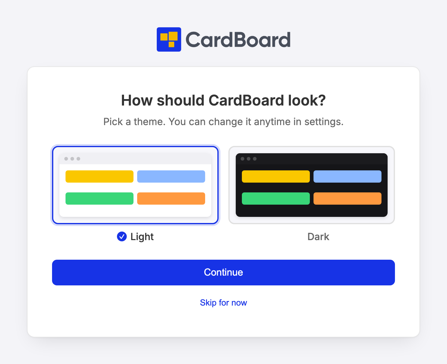
Already using CardBoard? Go to Preferences → Display & appearance.
Each board also has its own background, Light, Medium, Dark, or Chalkboard, in board settings.